Don’t worry, I’m not going on hiatus again, but suddenly everyone around me thinks I’m some kind of magic djinn as they dump their mess in my lap and run for cover.
Of course they sure as hell wouldn’t give my ideas a moment’s consideration back when the situation was realistically manageable. Oh, no… That would might have implied the ungrateful SOB’s had a shred of respect for me.
So now that everything is out of control, I’m their fallback plan. It was nice of them to tell me ahead of time… Oh wait. They didn’t do that either. They just waited until all the shit was fucked, then flippantly dumped it on me as if I’m supposed to not mind a single fucking bit.
Well, I’ll just get right on it and make everything all right again, and once that happens they’ll want their reins back. Nothing ever changes, and once I’ve fixed their problem, they’ll sneer at me with contempt for being better than they are.
A young woman having no luck in starting a family consulted her physician. After the results of numerous tests came back, the doctor was further perplexed and decided to confer with his two colleagues
As the three doctors were discussing the young woman’s condition, the first one came to the conclusion, “Well, it’s obvious this woman is impregnable,”
“Perhaps,” said the second, “but it is my belief that she is inconceivable.”
“No, no, no!” scolded the third. “It should be obvious by now that the woman is simply unbearable!”
If you’ve been watching the sidebar this past week, you might have noticed that the speech bubble font has changed. I thought I’d write a brief article about it and share it with you here today.
One of the things I pride myself on is the fact that I created my own font for the comic. Back in 2004 I tossed a serif font into the comic, and it was impossible to read. I really didn’t pay any attention to the idea of fonts at all, but quickly realized something just didn’t look right.
It didn’t take long for me to stumble into Comic Sans. Shortly after, I starting to notice how much the internet seemed to hate this font, which is a shame, because it really is a good font. Not in the mood to champion a lost cause, I set out to forge my own font with FontForge.
Of course the first version was absolutely abhorrent. I didn’t know what I was doing. It was monospaced. The characters where supposed to appear handwritten, but these looked downright arthritic. It was just very, very bad. That font was revamped and overwritten several times while I used it for the daily panel. Eventually I felt it was “tolerable”. Overtaxed on my creative output, I called this font aaa.ttf. That way it would be easy to locate at the top of the font list.
That font lasted until about 2009 when I revamped it again. This time I named it the aab.ttf. Even though the only real difference was a heavier and more consistent line weight, it was a lot easier to read. There were still some aspects of it that bothered me back then. Why were other comic fonts able to me more legible in smaller spaces? This is kind of an important thing since the comic has to surrender an unfortunate amount of space to the speech bubble.
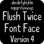
And that brings us to the present. I finally took the time to sit down and give the Flush Twice font a complete overhaul. Many of the typefaces were redrawn from scratch, and I finally figured out how to standardize the spacing. The size of the characters has not changed, but I can fit more text in a smaller area. If I’m to be totally honest though, I still don’t know what I’m actually doing. I don’t know how to properly design a font, so it’s glitchy. On a positive note, I feel the look of the font has significantly improved.
The image above is a before and after of the font. As you can see, the bottom one is bolder and takes up slightly less space. IMHO it’s easier to read because more of the word stays inside your foveal vision. I really like my font. It’s no Comic Sans, but that’s probably a good thing. While I probably spent way too much time making this font, I’d do it again in a heartbeat. There’s just no way I’d feel as good about my work if I used a font that someone else designed.
Flush Twice has been around since May of 2003. It started out as a JOTD (Joke of the Day) website. New jokes were published every weekday. Over the years, good jokes were increasingly hard to come by, and eventually they got so rare that I just stopped trying to publish them.
Since 2004 there has also been an eponymous comic. I still occasionally publish a new one on Saturdays. It’s also rare anymore, but sometimes it happens.
Here lately I’ve been posting a “Link of the Day”. For the time being, I will be featuring a new website from my enormous collection of bookmarked websites every weekday. None of it is solicited promotions, and no one is paying me to feature their site. These are just websites that at one time I thought were interesting enough to add to my bookmarks folder.
I highly encourage using some kind of ad blocking extension before clicking on any of these links. You’ll also hear me say this phrase a lot about these posts: “They can’t all be winners.” But it’s better than just leaving the site abandoned.
The jokes were generously provided by friends and visitors such as yourself. I want to express my eternal thanks to everyone over the years who helped contribute to the collection.
So what is it that makes a joke funny?
It all boils down to a sudden shift in perception. The story starts you thinking one way, then the punchline turns that thinking on its ear. The art of the joke is to craft a short story that isn’t overly contrived, then deliver a punchline that suddenly shifts your perception about the story you were being told.
Many of the jokes on this site are offensive, and I make no apologies for it. Offensive jokes work by making the reader uncomfortable through the use of a taboo subject thus enhancing the underlying humor. Without the offensive element, the joke would simply not be as funny.