
The Comic’s Font
If you’ve been watching the sidebar this past week, you might have noticed that the speech bubble font has changed. I thought I’d write a brief article about it and share it with you here today.
One of the things I pride myself on is the fact that I created my own font for the comic. Back in 2004 I tossed a serif font into the comic, and it was impossible to read. I really didn’t pay any attention to the idea of fonts at all, but quickly realized something just didn’t look right.
It didn’t take long for me to stumble into Comic Sans. Shortly after, I starting to notice how much the internet seemed to hate this font, which is a shame, because it really is a good font. Not in the mood to champion a lost cause, I set out to forge my own font with FontForge.
Of course the first version was absolutely abhorrent. I didn’t know what I was doing. It was monospaced. The characters where supposed to appear handwritten, but these looked downright arthritic. It was just very, very bad. That font was revamped and overwritten several times while I used it for the daily panel. Eventually I felt it was “tolerable”. Overtaxed on my creative output, I called this font aaa.ttf. That way it would be easy to locate at the top of the font list.
That font lasted until about 2009 when I revamped it again. This time I named it the aab.ttf. Even though the only real difference was a heavier and more consistent line weight, it was a lot easier to read. There were still some aspects of it that bothered me back then. Why were other comic fonts able to me more legible in smaller spaces? This is kind of an important thing since the comic has to surrender an unfortunate amount of space to the speech bubble.
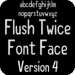
And that brings us to the present. I finally took the time to sit down and give the Flush Twice font a complete overhaul. Many of the typefaces were redrawn from scratch, and I finally figured out how to standardize the spacing. The size of the characters has not changed, but I can fit more text in a smaller area. If I’m to be totally honest though, I still don’t know what I’m actually doing. I don’t know how to properly design a font, so it’s glitchy. On a positive note, I feel the look of the font has significantly improved.

The image above is a before and after of the font. As you can see, the bottom one is bolder and takes up slightly less space. IMHO it’s easier to read because more of the word stays inside your foveal vision. I really like my font. It’s no Comic Sans, but that’s probably a good thing. While I probably spent way too much time making this font, I’d do it again in a heartbeat. There’s just no way I’d feel as good about my work if I used a font that someone else designed.
Pax,
f2x
[Comments]