My Current Style
So there are rules that I must follow when I make a comic. Naturally because they’re my rules, I can change them on a whim, but the rules are about consistency, and that consistency becomes the style. So for today’s rant, I thought I’d just pontificate on the style of my comic.
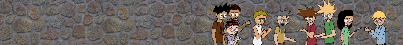
Since late 2005 my panels had consisted of a thick black border that the speech bubbles could overlap. Sometimes, like in yesterday’s panel, The border becomes just a background. Usually I only do this for holiday promotions, but it’s not a hard and fast rule.
The speech bubble tail has to point to the speaker’s mouth. I read somewhere once that it only has to point to their head. Oh no. That tail needs to point to the mouth or it just looks really sloppy.
The text is my own font. I hope you like it. I’ve only been working on it for the past 13 years. For some reason, I never thought the comic looked right using all capital letters. I’m usually quite fastidious about spelling and grammar.
The character shading is something that evolved from a tutorial on how to create a mercury puddle effect in Paint Shop Pro. It’s the same concept but handled in a different way because the original method wouldn’t scale to higher resolutions. This stylistic shading has become my signature technique, and it’s even fooled some people into believing 3D software was involved.
Speaking of 3d software, a few years ago I started fooling around with the editor in the Cube 2 engine, aka “Sauerbraten“. By the end of 2011, I switched to using screenshots of my designs.
I don’t always use the screenshot sets though. Occasionally I use a shaded cube background for when the setting isn’t really all that important or I’m just being lazy. It’s also a thing where I’ll just leave it black for that borderless look.
And now that leaves me with the last thing I’ll mention: The follow up text below the comic. Honestly I should know better. The comic should stand on its own, but for some reason I feel compelled to elaborate. It’s gotten to the point that sometimes the comic doesn’t make sense unless you read the exposition. I really need to work harder on avoiding that.
So that’s about all I’m going to write about for today. What other stylistic characteristics do you think exemplifies “Pathos in the Plumbing”? I’d love to hear what any of you have to say.
Pax,
-f2x
